
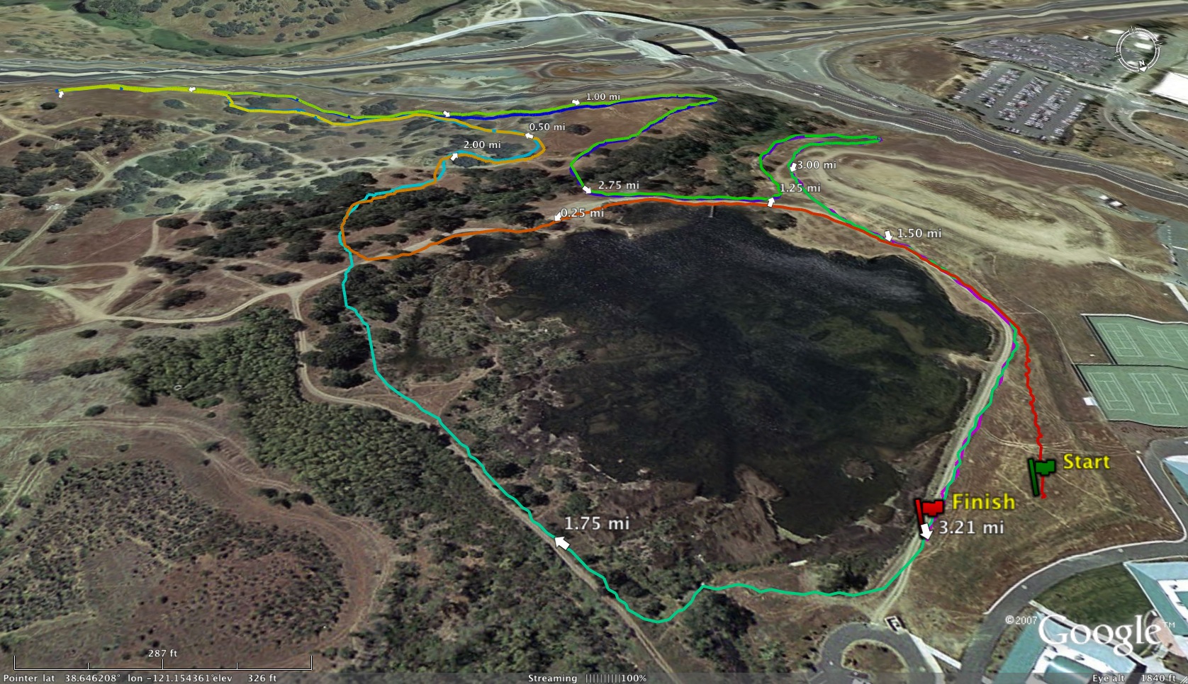
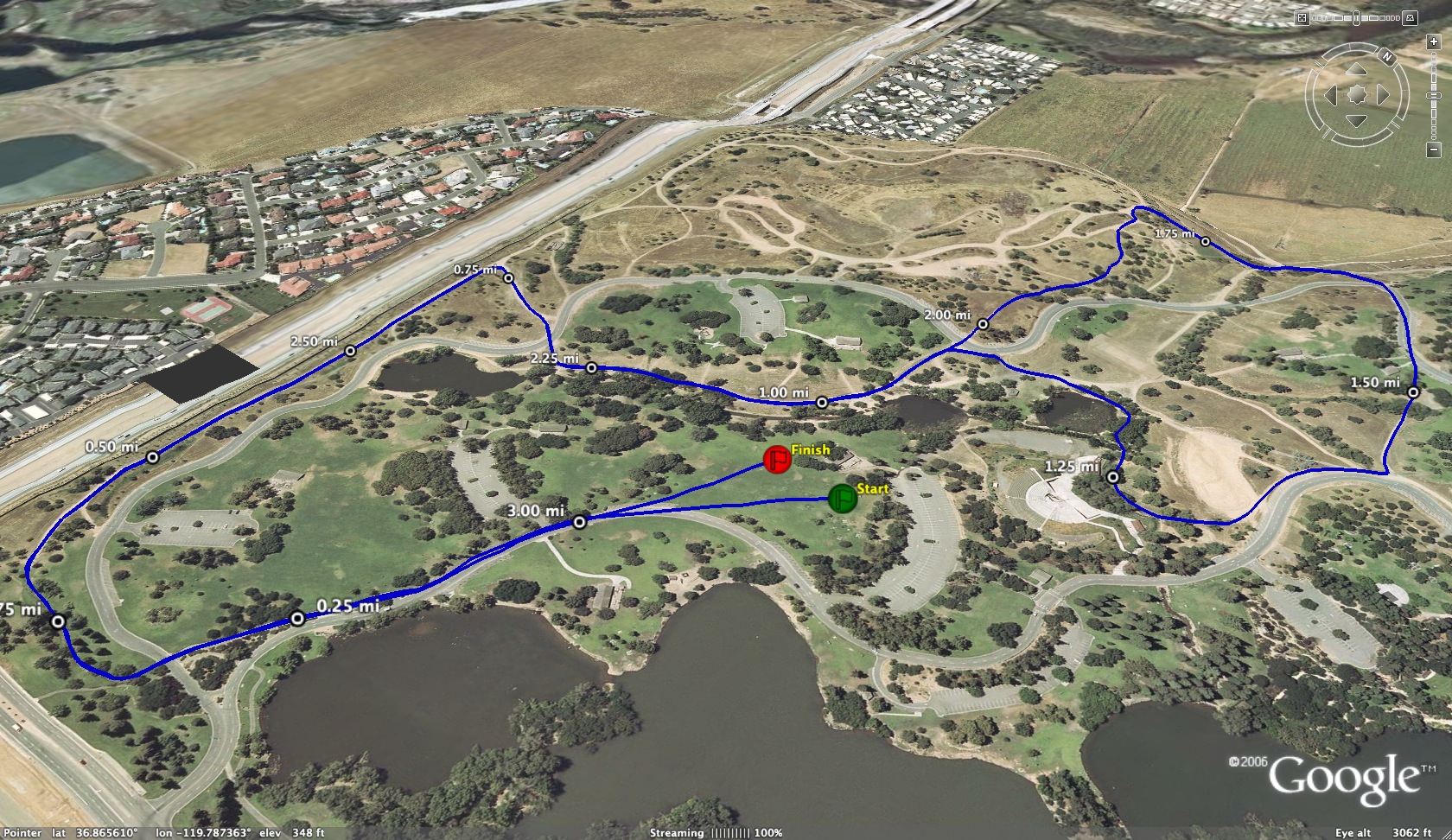
Check out this tool for graphing the frequency distribution of performances at many California cross country courses.
http://www.xcstats.com/course_
The simplest way to think about it is that it gives an SAT score for running. For a given performance, it shows where that time stands in relation to the overall population of high school runners.
Here is the graph for Crystal Springs. As shown, the most common time for boys varsity runners looks to be 17:45 and for non-varsity around 18:50. (These are the highest points on the curves). A time of 19:00 is faster than 61% of all runners and faster than 31% of varsity runners.

The graphs are generated by taking the results of races from 2006 to present, then grouping the performances into bins, for example 16:10 to 16:20, then graphing the number of races who fell into that range. It’s quite simple. For the statistics minded, we used the number of bins based on the square root of the number of races, then eliminated any courses where the bin size was over 20 seconds. The amount of source data ranged from 500 races to over 48,000 at Mt. Sac. The graphs are normalized so that the area under the curve is 1.
Enjoy!
Mike Sherwood
www.xcstats.com
PS – We also have a course time converter which simply uses the average times of runners to determine the conversion factors. Not nearly as fancy or accurate as Sstoz’s work!


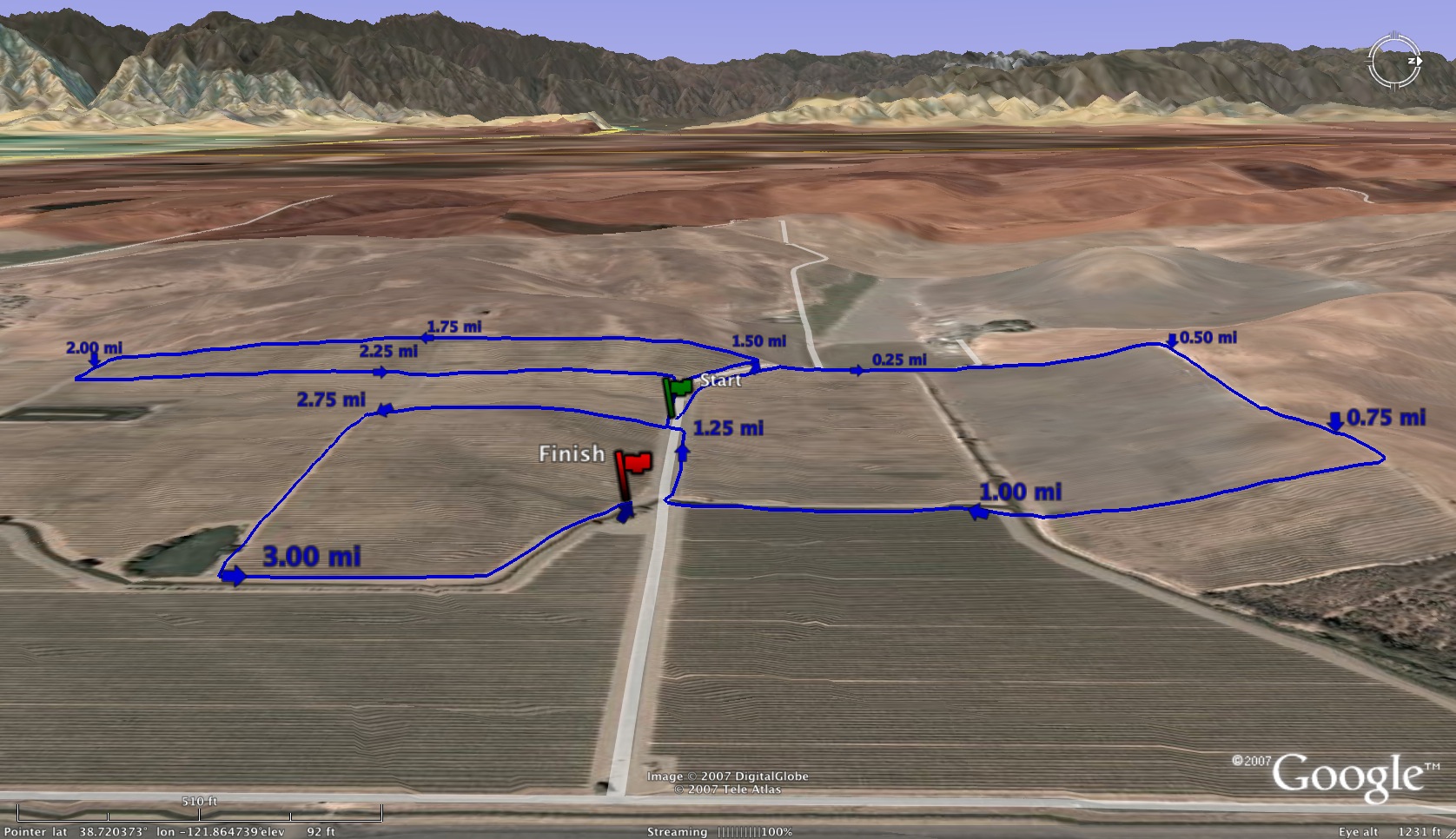
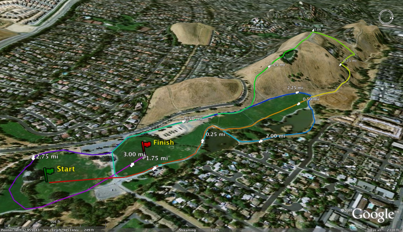
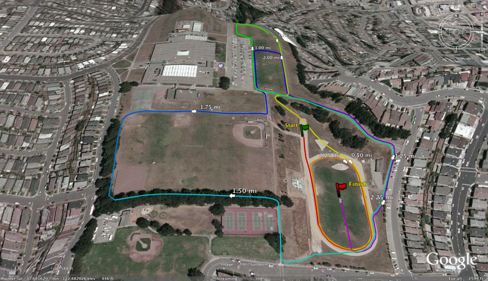
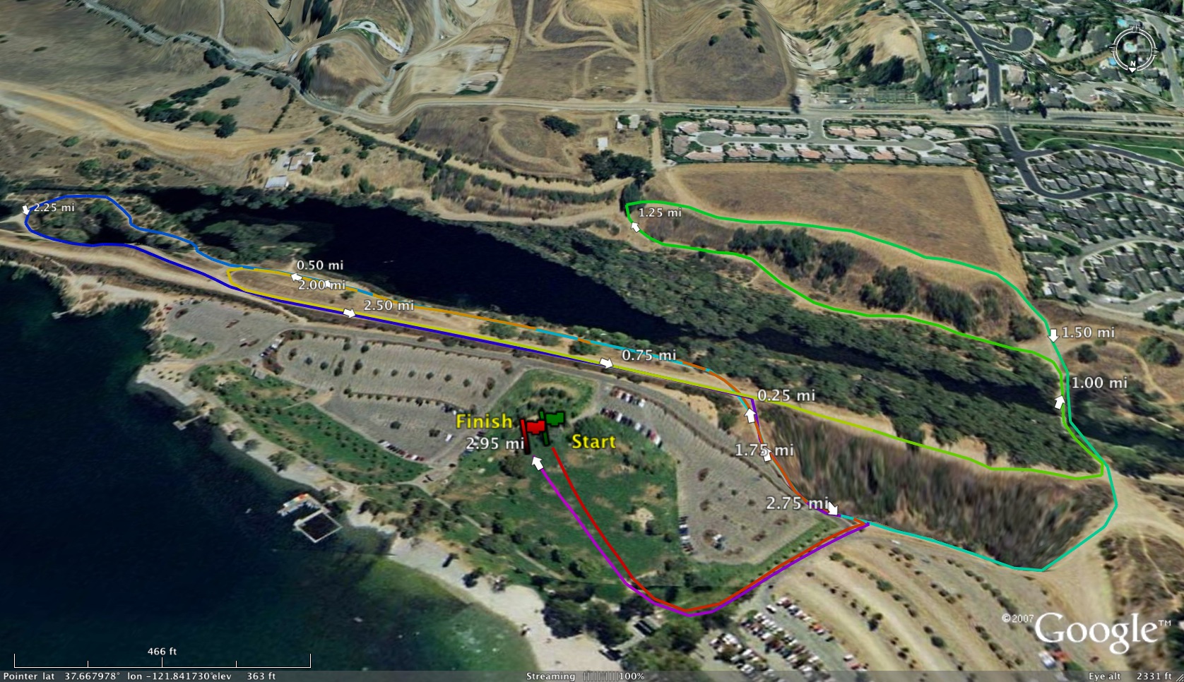
6 comments:
Is the Stanford Invitational XC course really only ~10-15 seconds slower than the Golden Gate Park course? It's almost .2 miles longer... the Golden Gate Park course can be pretty wet at times and has some sharp turns etc. but does it make it that much slower than Stanford?
Ooooh, competition between our two cross coountry statisticians is heating up.
It's controversy that makes these discussions fun but unfortunately I'm not going to be able to add fuel to it. Sstoz points out all of the complexities of this analysis and his methods take them into account. My method averages the times of all runners on a course and uses that as the basis of the conversion factor. This method relies on the assumption that the profile of runners on one course is the same as another. That's probably a good assumption for courses that are not mostly used for championship-type races. But Anonymous #1 spotted a case where it is not true. In general, Stanford runners are faster than the GG runners and therefore in the conversion between the two, Stanford looks faster than it should. The inaccuracy is blatantly true for Woodward comparisons. So, XCStats data should be fairly good for the population distribution curves and for the conversions between any two commonly used courses, but look to Sstoz's data for more accurate analysis of the high profile courses.
Mike
I think the only way to accurately measure is to look at the SAME runners running the SAME course. For example, take all the runners at GG park and see what they run at Stanford... rather then looking at the top Stanford times (which is a more competitive invitational) vs. the top GG park times.
First things first: I am not "Anonymous."
Though it may seem that direct comparisons are more precise and accurate than sampling, they are also time consuming and can be mis-leading, particularly when one does not neutralize outliers. The idea is for the results to allow one to generalize out, and even in populations of hundreds, one outlier can skew a generalization.
For most purposes, a sufficiently sized random sampling will give reliable results. This is a fundamental basis of statistics, though proper implementation, particularly with non-standard distributions such as one finds in running, is also one of its most contentious. I chose to use populations and direct comparisons because I enjoy tedium and the challenge of working with populations. I did not do it because population statistics make for better predictiveness or accuracy.
The unfortunate thing about Stanford, at least for those looking for correlations, is that the course changes every year, sometimes substantially, making each year's statistics sui generis. Though it tends to compound errors, one could do a proxy comparison, in which a given year's Stanford results could be compared to a previous year's Stanford results that had been correlated to the state-meet.
I really enjoyed playing with the course calculator, inputting my own times throughout the years on the Crystal Springs course, for example. I also put in my son's times from his races on the available courses for his first year of XC last year, and, sure enough, his perception that one particular race was his best performance looks to be correct.
Regarding Anonymous #3's statement about looking at the same runners running the same courses, I think that is a good way to compare if you have enough of them and, as Sstoz suggests, you ignore the outliers. I recently used that to see if my performance at one triathlon was indeed worse than at a different one. There were seven other competitors in my age group that completed both races, and every one of them improved his time from the first one to the second. I was the only one who was slower in the 2nd race, so I think it's reasonable to conclude that I just sucked that day (hey, it happens)! :-)
Post a Comment